
2014
Autospeak-Straight Talk contains articles covering digital and social media marketing social communities and events marketing
By Rieva Lesonsky, CEO of GrowBiz Media

Are you a small retailer in a cold sweat about showrooming? This trend where customers browse in-store but then buy products online, began striking fear into retailers’ hearts a few years ago.
Who wants customers coming in, trying on or feeling the products you offer, and then buying them at a deep discount from Amazon or some other site?
The trend was especially unsettling for small, independent retailers. While big national chains with huge volume may be able to afford to price-match online sellers, independents are less likely to be able to do so without losing their shirts.
But a new report from Merchant Warehouse suggests that instead of stressing about showrooming, small retailers should welcome “webrooming.â€
What is Webrooming?
The reverse of showrooming, webrooming is when consumers research products online, then come into a physical store to buy them.
Webrooming is even hotter than showrooming – and it’s creating new opportunities for brick-and-mortar retail stores.
What You Need to Know About Webrooming
It’s more popular than showrooming.
Some 75 percent of men and 63 percent of women webroom, compared to 53 percent of men and 40 percent of women who showroom. By other demographic measures, such as age, consumers are also more likely to webroom than to showroom.
What might surprise you is to learn that consumers aged 18 to 36 are equally avid webroomers as those aged 49 to 67. Sixty-nine percent of both groups webroom, but only 50 and 44 percent respectively showroom. And while 90 percent of showroomers have also webroomed, just 60 percent of webroomers have showroomed.
Why Do Consumers Webroom?
Particularly when they could just as easily order a product online – why add that extra step?
That’s up to you. Merchant Warehouse suggests doing it during especially competitive times, like the holidays. However, be aware that information spreads rapidly on social media today and if you price match for one person, he or she is likely to tell friends who will then expect the same treatment (and may badmouth you if they don’t get it).
If you do price match, you may want to set limits such as price matching one item per customer or deduct a certain percentage from the price without actually matching. That way, the customer is still getting a deal while also getting the product quickly.
Check out the graphic below for more.

Are you a small retailer in a cold sweat about showrooming? This trend where customers browse in-store but then buy products online, began striking fear into retailers’ hearts a few years ago.
Who wants customers coming in, trying on or feeling the products you offer, and then buying them at a deep discount from Amazon or some other site?
The trend was especially unsettling for small, independent retailers. While big national chains with huge volume may be able to afford to price-match online sellers, independents are less likely to be able to do so without losing their shirts.
But a new report from Merchant Warehouse suggests that instead of stressing about showrooming, small retailers should welcome “webrooming.â€
What is Webrooming?
The reverse of showrooming, webrooming is when consumers research products online, then come into a physical store to buy them.
Webrooming is even hotter than showrooming – and it’s creating new opportunities for brick-and-mortar retail stores.
What You Need to Know About Webrooming
It’s more popular than showrooming.
Some 75 percent of men and 63 percent of women webroom, compared to 53 percent of men and 40 percent of women who showroom. By other demographic measures, such as age, consumers are also more likely to webroom than to showroom.
What might surprise you is to learn that consumers aged 18 to 36 are equally avid webroomers as those aged 49 to 67. Sixty-nine percent of both groups webroom, but only 50 and 44 percent respectively showroom. And while 90 percent of showroomers have also webroomed, just 60 percent of webroomers have showroomed.
Why Do Consumers Webroom?
Particularly when they could just as easily order a product online – why add that extra step?
- 47 percent don’t want to pay for shipping. To make sure you capture the sale, try offering coupons good only for users who visit your site, then buy a product in-store. Or allow customers to order online and pick up in-store to save on shipping.
- 46 percent want to see and touch a product before buying it. This is especially important with “sensory†products like home furnishings, clothing and cosmetics. Encourage customers to test products in-store, and create displays that are tactile and inviting.
- 42 percent want to check in-store availability online - then go to the store so they don’t waste a trip. Look into an eCommerce system that has this capability for your store, and educate employees about the importance of making sure data is accurately maintained so customers aren’t disappointed.
- 37 percent want to be able to return products to a physical store. You can capture both online and in-store sales to these consumers by offering the ability to buy online and return in-store.
- 23 percent don’t want to wait for delivery. For those impatient consumers, be sure you have in-store availability information on your eCommerce site so they can check it out. Make sure that your clerks have accurate inventory info at hand in case the customers call the store as well.
That’s up to you. Merchant Warehouse suggests doing it during especially competitive times, like the holidays. However, be aware that information spreads rapidly on social media today and if you price match for one person, he or she is likely to tell friends who will then expect the same treatment (and may badmouth you if they don’t get it).
If you do price match, you may want to set limits such as price matching one item per customer or deduct a certain percentage from the price without actually matching. That way, the customer is still getting a deal while also getting the product quickly.
Check out the graphic below for more.
[Click graphic above for larger version]
 By Jamie Smith
Interested in some real-life evidence of how A/B testing can generate significant lift in profit?
A/B testing is not something you do once and then forget about; it's an ongoing process to extract the maximum conversion rate for your website. It's a process that includes testing every last detail to find the optimal layout, text, and images for your site. Sometimes, even the smallest changes can yield significant results.

Let's take a look at five A/B tests with significant results.
1. Customer Testimonials
You can write copy at length about how your product or service will benefit your customers and do wonders for them, but third-party credibility is much more influential.
With that in mind, how would customers respond to impartial reviews from actual customers? Could the positive experience of previous customers help eliminate any apprehensions from the prospect about buying the product?
These were the questions asked by ecommerce store Express Watches. In their A/B test, they added a small widget below the Add to Basket button, where genuine customer reviews were displayed.

IMG testimonials visual website optimizer.png
The results were game-changing for the business. The positive customer reviews reduced buyer objections and boosted their sales by an impressive 58 percent.
The best thing about customer testimonials is they are incredibly easy to implement – just add them to your site or install something like the Trust Pilot widget.
Takeaway:Â Always use positive customer testimonials as social proof since third-party reviews carry much more weight than what you write about yourself.
2. Higher Prices = More Revenue (Sometimes)
Not all A/B tests require you to tweak your website's design; one of the simplest things you can test is your pricing strategy.
It doesn't take a rocket scientist to determine that when you reduce your prices, you will generally make more sales, and vice versa. However, less certain is the impact the change in price will have on your bottom line – will your monthly revenue be better or worse for the pricing change?
That's where the economic concept related to elasticity of demand comes in.
To explain this further, let's take a look at a pricing A/B test Six Pack Ab Exercises ran.
Uncertain as to whether they were leaving money on the table, owner Carl Juneau tried increasing the price of his product from $19.95 to $29.95.
Although the number of conversions fell by 9 percent, this was more than offset by the additional 50 percent revenue he was receiving per conversion. In time, this simple price change would allow him to bank 36.48 percent more revenue.
Now, increasing your price won't positively affect your bottom line in every case – in some cases alower price will yield a higher profit – but it does highlight the importance of finding your profit maximizing price.
Takeaway:Â Pricing strategy is part of A/B testing. Test higher and lower prices to see what brings in the most revenue and profit.
3. Trust Symbols Boost Conversions
With all the scam reports out there, online shoppers are understandably cautious about handing over their credit card details willy-nilly. You need to find a way to put their minds at ease. After all, would you buy something from a website you don't trust?
Credibility and trust is something that you develop over time, just like in a dating relationship. But, there are ways to increase the trust level of your website, even if you're new to the Internet.
Bag Servant identified lack of trust as a primary reason for low conversion rates and small order values on their site, and set about implementing an A/B test to improve performance.
Initially, Bag Servant was dependent on social proof, and prominently displayed a badge highlighting their 4,000+ strong Twitter following in an attempt to establish trust.
This wasn't working.
For their A/B test, they replaced the Twitter followers badge with a WOW award badge they had received.

Because this badge was a relatively well-respected symbol in the industry, this improved the site's credibility and helped removed buyer's doubt.
The result? Conversion skyrocketed more than 72 percent.
Takeaway:Â Always look for ways to increase credibility on your site. This can be with awards, social followers, testimonials, or SSL trust symbols like Verisign, Hacker Safe, or McAfee.
4. Know Your Audience
You might think you understand what your audience wants, but just how well do you really know them?
Product quality, guarantees, offers, price, and shipping fees matter to all consumers. The bigger question is what matters most to your customers.
Smiley Cookie, a niche e-store, sells fresh, customized cookies as gifts for special occasions.
On their website, they wanted to add a new value proposition to help boost sales. They ran an A/B test to help them choose from the following:
- Next-day shipping.
- Discounted price.
- Free shipping on orders above a certain value.
- Fixed rate shipping for any order value.
- High quality, handmade cookies.

Smiley Cookie had expected that customers would be most responsive to the value propositions on price (discounts) and quality (handmade cookies).
But guess what? There was a surprise winner: next-day shipping.
How did that happen?
Because most customers tend to purchase cookies as a gift (and gifts are almost always last-minute things), making sure it arrives on time is imperative. Throw in the fact that cookies are perishable and need to arrive fresh, and perhaps the results aren't so surprising after all.
That's not to say that next-day delivery is the most important factor to your audience. It does show, however, that understanding what your audience really wants is vital for getting results with your A/B tests.
Takeaway:Â You need to find out what matters most to your customers and highlight that aspect of your product on the landing page or in the offer.
5. Accepted Best Practices Don't Work Every Time
Although a bit of logical thinking can often predict the outcome of an A/B test, ignorant Internet surfers love nothing more than throwing up anomalies that defy the conventional wisdom.
Here are four testing tips used to generate more revenue.
Remember, just because something works on one site – or even the vast majority of sites – doesn't necessarily mean it will work with you.
Let's look at an example to highlight this point: the Vendio signup form.
Now, any guide to CRO will tell you that an embedded signup form on the homepage will boost conversions; after all, if it takes fewer clicks for a user to register, they ought to be more likely to do so.
Sensibly, this was the approach Vendio took when first designing their layout.
Just to ensure they were taking the right approach, though, Vendio A/B tested their embedded form against an unconventional alternative: users would have to click an extra button to reach the signup form.
Surprisingly, this worked! With one extra step added to their conversion funnel, signups per visitor increased by 60 percent.
Takeaway:Â Don't blindly accept best practices. Find out what works best for you with independent testing.
Wrapping Up
Conversion rate optimization isn't an easy technique to master, particularly when there is such a wide range of variables and factors that go into testing.
And just because you've managed to increase your conversion rate doesn't mean you get to rest, especially if there are any major aspects of your site that haven't been tested. If you only focus on one page, you will be leaving money on the table.
Most importantly, the cost-per-click (CPC) to bring a visitor to your website is increasing and if you don't improve your conversion rate, your cost to acquire a customer (CPA) will continue to rise. Therefore, never stop testing, because even the smallest lift can yield big-time changes to your bottom line.
Â
Geotargeting drives key brand engagements even when stores are closed
Tags:
(Posted on May 19, 2014 at 10:51AM )
 While much of the talk around geofencing has focused on driving foot traffic with an ad delivered to a nearby customer, a growing number of retailers are recognizing opportunities with geofencing after stores close or when a location has shut its doors for good.
The trend points to the growing sophistication of mobile marketing, with brands increasingly looking beyond simple location to take into account other factors that can drive more contextually relevant experiences for consumers. For example, by geofencing stores that have recently shut down, retailer Ashley Stewart hopes to retain customers by driving them to another nearby outlet or to its mobile site.
“Geofencing - or location based targeting - can be an effective tool when stores close,†said Pehr Luedtke, CEO of Spotzot, San Francisco. “Retailers can geofence an area around the closed store and alert consumers to nearby locations, and even provide special deals to those consumers if they go to another store.
“It's a way to maintain loyalty,†he said.
Customer retention
Ashley Stewart recently announced a Chap. 11 bankruptcy restructuring plan that includes the immediate closure of 27 stores and a likely sale of the company. The chain has 168 locations across 24 states.
Holding onto existing customers is critical for the retailer during this period of upheaval, with location-based targeting on mobile one way it is looking to retain them.
The retailer is currently working with Spotzot on a campaign that will launch in the next few weeks in response to the fact that some stores have been closed.

“We want to geofence customers who shop at those stores and use Spotzot to get customers to shop at the nearest location or to transfer onto the Web so that we don’t lose that customer,†said Larry Gray, CRM director at Ashley Stewart, Secaucus, NJ.
“That is a very big project for us,†he said. “It is very important to us.
“It helps us to reduce our churn and customers lapsing from the business and it gives us the opportunity to send new customers into the store that remains in the market.â€
Better than direct mail
Ashley Stewart is also considering delivering coupons to customers nearby competitors’ stores in a strategy known as geoconquesting.
Ashley Stewart has been ramping up a coupon-driven mobile advertising program over the past six months with a several different providers.
Mobile couponing is becoming increasingly important for the retailer as direct mail prices continue to increase.
“It is a very important strategy,†Mr. Gray said. “It is a regular part of our couponing.
“We are reducing our direct mail with the postage rate increases, we are reducing that end of it and really pushing on this end of it,†he said.
“It is definitely more efficient than our direct mail — I would say two to three times more efficient. It is probably maybe a quarter of the budget and then there is may be 50 percent that is direct mail and then there is email that rounds things out.â€
Situational targeting
1800Flowers is also trying to use geo-targeting in more contextually relevant ways.
When a recent geotargeted campaign delivered to users within a mile of 100 franchise retail locations revealed significant click-through rates between midnight and 4 a.m., when stores were closed, the ads were tweaked to include a click-to-call button and a buy online button.
The results proved to 1800Flowers that geotargeted ads are not only effective when retail stores are open.
The retailer also gained a competitive advantage since other brands were not likely tailoring their efforts towards consumers who were out and about that late at night.
The lesson from these examples is that using geofencing to deliver ads should not simply about a location but needs to also take into account a user’s context.
However, geotargeting during off hours is likely to be more limited simply because there will be less traffic near a store during these hours.
“A great use case would be for a closed store to send a message to the customer saying the store was closed, but “you can browse our inventory/order from us at our website†and/or point them to a different location,†said Janna Badalian, marketing director at MobileSmith, Raleigh, NC. “This keeps customers from having to walk up to a door only to find the store is closed, as well as provides an alternative to drive sales.
“Retailers haven’t fully embraced geofencing yet, since it is so new,†she said. “That said, people are coming up with new use cases for it all the time, and not just for retailers either.â€
Final Take
By Chantal Tode associate editor on Mobile Marketer, New York
Associate Editor Chantal Tode covers advertising, messaging, legal/privacy and database/CRM. Reach her at chantal@mobilemarketer.com.
 In our latest ebook, “A Marketer’s Guide to UX: The ‘Invisible Elements That Fuel Success,†we explored how a website’s design, form and function affect the number of visitors who stick around to complete goals. What makes UX such an important subject is that it’s recently become more complex.
Twenty years ago, futurists were already trying to figure out what life in an online world would be like. Some of them, like author Michael Heim, assumed we’d all be living in a digital matrix, but their concerns about frames of reference, content and choice are now strikingly relevant.
Already, in the electric element, the need for stable channels of content and reliable processes of choice grows urgent. [...] Cyberspace without carefully laid channels of choice may become a waste of space.
The Metaphysics of Virtual Reality — Michael Heim
We don’t live in an immersive online reality yet (although Google Glass gives us a hint of where tech companies would like to go), but even though we’ve managed to confine cyberspace to screens on our desks or in the palms of our hands, some of the challenges futurologists worried about have come to pass.
The modern web needs to follow physical rules of design, information architecture and usability, just like a virtual world might. But there’s also the issue of choice. In both an immersive digital reality and today’s internet, how will you ever be able to make a choice if you can do anything, click anywhere and look at it all? This is an important hidden element of UX, and one that will impact all content marketing campaigns.
Marketing in the Matrix
The question of choice in marketing has its roots in the offline world. Susan Broniarczyk, a professor of marketing at UT Austin’s McCombs School of Business, first identified the phenomenon in her 2005 paper, “The deleterious  effects of living in consumer hyperchoice.†She identified purchasing paralysis as the consequence of:
- Consumers making more purchases each year
- People are choosing in a market with more new products than ever before
- Individuals are subject to more demands for their attention
- Buyers have less free time than in the past
When faced with this reality, many consumers simply stop shopping for items altogether. But don’t customers say, time and again, that choice and variety are one of the most important attributes a business can have?
Maximize & satisfy
Part of the issue may come down to a principle researcher Barry Schwartz describes in “The Tyranny of Choice.†He breaks down most consumers into two groups:
- Maximizers, who are determined to find the best product or service for the best value, and they won’t give up until they’ve found it. They value money over time.Â
- Satisfiers, who will only spend so much time researching before they make a purchase. These customers are more concerned with time than money.
Part of the problem may lie in the fact that people don’t want to admit that they’re Satisfiers. The internet supposedly empowers people to make smart buying choices, so when asked, of course they’re going to say they’re skilled shoppers. But it may be true that ecommerce and online marketing are at their best when they save people time, rather than money.
You can’t choose your way out of a jam
Columbia University conducted a study of consumer choice by offering customers at a supermarket free samples. One set included 24 different flavors of jam, while another was only comprised of six types. While 60 percent of shoppers tasted from the 24-variety group, only 3 percent of them made purchases. Conversely, 40 percent of shoppers tried from the six flavors in the second group, but 30 percent of them bought jam.
With fewer choices and more design clarity, your traffic might be lighter, but it would lead to more purchases.
Think about these figures in terms of web traffic and goal completion. With fewer choices and more design clarity, your traffic might be lighter, but it would lead to more purchases.
UX: When not choosing is a chore
So what can marketers do? Here are some ways to carefully curate a web page to ensure it isn’t so open-ended that customers flee en masse.
-
Design: Don’t offer too many options
 Websites should be visually clean, meaning that colors don’t clash, text is easy to read and all elements follow a clear optical hierarchy.
Don’t include a link to every part of a site from the homepage, or a landing page for that matter. It’s estimated that modern humans in industrialized society make more than 70 important choices every day – so try not to give customers too many more of them. Make it obvious where they should click, and limit the number of elements that are actually hyperlinks.
- Information architecture: Front-load choices
According to a study by Stanford University, the closer people are to the conclusion of a task, the more choices will derail them. If there are options on a website, they should appear earlier in the purchasing or goal-completion process. For instance, don’t make consumers fill out half a dozen forms on separate pages just before a transaction is complete.
- Usability: Set default options
A study of workplace retirement plans found that when employees were asked to make choices before plans took effect, only 9 percent ended up participating. However, when workers were allowed to opt-in with default settings in place, participation shot up to 24 percent.
If you want or need to make options available, you don’t have to make it a requirement. Instead, let the Maximizers make additional decisions while the Satisfiers simply click ‘OK.’
Digital UX: Only on screens…for now
We’re still a long way off from spending all of our time in an immersive digital simulation, Google Glass and the Oculus Rift notwithstanding. But even if we lived in a cyberpunk dystopia where it was impossible to tell when existence begins and virtual reality ends, the same rules would still apply: Visual design has to make sense, information needs to be organized and functions must work.
And too much choice is no choice at all.
By Alex Butzbach Marketing Writer at Brafton.
Fastest-growing Top 500 merchants give the customer what she wants
Tags:
(Posted on May 5, 2014 at 10:21AM )
Sur La Table, Uniqlo, RealReal.com and the other fastest-growing merchants ranked in the 2014 Top 500 Guide deployed new features and listened to customers to put e-commerce on a faster track.

 RealReal.com, a deep discounter of used and consigned luxury apparel and accessories, stimulated growth with an updated mobile app that automatically puts a shopper on a wait list for similar items if a product she wants is sold out, says founder and CEO Julia Wainwright. At the fastest-growing Top 500 consumer brand manufacturer, jewelry maker Alex and Ani, the key to sharply higher web sales was marketing via social media and better use of customer data, says Ryan Bonifacino, Alex and Ani vice president of strategy. The company grew online sales 249.7% to $45.7 million in 2013
Overall 172 Top 500 merchants, or 34.4%, met or exceed the overall growth rate, which was 17.1%. That compares to 166 merchants—33.2%—of all merchants in the 2013 Top 500 Guide.
At Sur La Table it’s a mix of new programs such as a ship-from-store program that will launch sometime in 2014 and more attention to mobile commerce that will drive continued growth in web sales, Ertell says. In 2013 about 40% of all traffic to SurLaTable.com came from a mobile devices and mobile commerce accounted for more than 10% of all sales, Ertell says. “We just want to keep on getting better,†he says.
For more information on how to order the 2014 edition of The Top 500 Guide click here.
Mark Brohan Research Director
There’s a pretty good reason web sales at cookware and kitchenware retail chain Sur La Table Inc. jumped 104.2% in 2013 to $56.8 million. But it wasn’t because Sur La Table, No. 303 in the 2014 Internet Retailer Top 500 Guide implemented a new multi-million dollar e-commerce technology plan. And Sur La Table didn’t completely re-invent its digital marketing plan. Instead, what made Sur La Table the second-fastest growing Top 500 chain retailer behind Japanese apparel and accessories chain Uniqlo Inc. (No. 495) is just that online shoppers are embracing a constantly improving web shopping experience, says senior vice president of digital Kevin Ertell.
“It’s not one big thing we are doing to generate more e-commerce sales but just the constant stream of small things we keep doing to make improvements,†Ertell says. In the last year Sur La Table has worked to improve SurLaTable.com by implementing a new site search engine from Oracle Corp. “With better site search the whole e-commerce shopping experience is now just more intuitive and personalized for each shopper,†Ertell says.
Sur La Table also implemented a new social media tool on SurLaTable.com called “My Collections†that lets customers shop for their favorite cooking or kitchen item, see similar items other shoppers have purchased, create a collection based on the results, and then share the collection with family and friends on Facebook and Pinterest. “We wanted to bring some aspects of social media to the site because we can use this as a tool to generate transactions,†Ertell says.
Many of the fastest-growing merchants in the 2014 edition of the Top 500 Guide cited improved features and functions as the reason why their online sales are growing at a brisk pace. The fastest-growing web merchant overall and among retail chains was Uniqlo, which increased web sales 341.3% to an Internet Retailer-estimated $22.06 million in 2013. Uniqlo, a chain owned by Japan-based Fast Retailing that only began selling online in the United States in 2012, credits its growth to faster search, one-click shopping on many product pages and a responsive design that enables Uniqlo to use one code base and one set of web content to render a site that fits the size of any screen.
Likewise the fastest-growing Top 500 catalog/call center company, Interline Brands (No. 90), which operates 14 business-to-business e-commerce sites and grew web sales 37.8% to $377.3 million last year, and RealReal Inc. (No. 295), the fastest-growing web-only merchant with 2013 e-commerce revenue that grew 296.8% to an Internet Retailer-estimated $60 million, also implemented new web site features. At Interline, which sells maintenance, repair and operations, or MRO, products to businesses of many sizes, the company added faster ways to track merchandise, new budget management tools and easier ways to repurchase certain items, says vice president of e-commerce, marketing and pricing Ramesh Bulusu.
Overall 172 Top 500 merchants, or 34.4%, met or exceed the overall growth rate, which was 17.1%. That compares to 166 merchants—33.2%—of all merchants in the 2013 Top 500 Guide.
At Sur La Table it’s a mix of new programs such as a ship-from-store program that will launch sometime in 2014 and more attention to mobile commerce that will drive continued growth in web sales, Ertell says. In 2013 about 40% of all traffic to SurLaTable.com came from a mobile devices and mobile commerce accounted for more than 10% of all sales, Ertell says. “We just want to keep on getting better,†he says.
For more information on how to order the 2014 edition of The Top 500 Guide click here.
Mark Brohan Research Director
If A/B Testing Can Help Win Elections, What Can It Do for Your Business?
Tags:
(Posted on Apr 29, 2014 at 11:42AM )
 Online retailers are always looking to differentiate themselves in more meaningful ways. Compelling shopping experiences, product recommendations, and overall superior customer service are key ways retailers set themselves apart. Today's data-driven marketing tools can help them unlock those experiences by using the data they have about their customers.
Prior to founding my own company, I served as the director of analytics on the 2008 Obama campaign. By experimenting with changes to elements of the campaign splash page, we were able to help raise an additional $57 million in campaign donations.
The guiding principles that made the campaign successful are no different from approaches online retailers and other marketers can adopt to make a real business impact.
First, you need to know your constituent. The behavior of visitors who come to your website is very much indicative of the kind of messaging that would work on them. What you show a returning visitor is different from what you'd show to a new visitor, or a mobile visitor vs. a desktop visitor.
The urgency for businesses to use data to show the right thing, to the right person, at the right time is stronger than ever. Targeted messaging is the most to effective way to get consumers to convert.
Second, you must know the facts. One of the greatest challenges (and areas for error) for businesses is getting the data right. Online retailers should take prudent effort to make sure the infrastructure and process they've implemented is sound. For example, the "novelty effect" suggests that just because a change has an impact initially doesn't mean it can be sustained over time. Will your customers grow tired of cyber deals every 10 minutes for a week?
Finally, it's imperative to ask the right questions. The challenge for online retailers is not about prescribing the right answers but about asking the right questions. For instance, are you trying to see whether a visitor will respond better to more product selections on a page, or fewer? Consider first what you want the answers to be, and those hypotheses will then help you decide what to measure.
Common examples of A/B testing for online retail include homepage bounce rates, category-page views, product-page views, shopping cart ads, and all stages in a checkout flow all the way to the Thank You page.
In general, to get more effective and relevant results, rather than asking "What are the variations we are testing?" consider asking "What question are we trying to answer?" To ensure the best return on your effort, first look at your Web analytics to see which pages have the most room for improvement. You'll want to attack those areas first.
The following are some actionable insights to help retailers optimize their sales by running website experiments that help them deliver a better experience to their visitors.
Homepage. The homepage is notoriously the most over-scrutinized page, yet it is also likely to be the most under optimized. For instance, imagine you're a consumer shopping on a retailer's website for a new coat. You arrive on the homepage and see a banner for a sale. Just as you're about to click it, the experience changes to pants. The rotating carousel of images means you have to continually reorient yourself, and it diffuses the focus of your original purpose. And when consumers are distracted, they're probably not purchasing.
Category pages. Unfortunately, most retailers tend to overlook their category pages; luckily, there are some easy and effective tests to evaluate them. One simple experiment centers on the performance of tiled vs. list views. For example, in our experience, the list views perform better and lift sales for scenarios in which consumers are making a complex purchase decision. The list format enables consumers to scan information easily and compare between categories; it also gives the retailer space to display the best sellers above the fold.
Product detail pages. Where does the consumer ultimately decide whether to buy or bounce? The product detail page is where the final persuasion happens. Therefore, it is one of the most important areas of your website.
Often, retailers are looking for a solution to a distinct challenge: solid brand awareness, but poor conversion. In that scenario, it's difficult for the retailer to determine what to improve. To increase conversion, I recommend carefully examining the following key conversion factors in the product detail pages:
- Value proposition:Â Is it strong or weak?
- Relevance:Â Is the content pertinent to the target audience and their needs?
- Clarity:Â How clear is the imagery, eye flow, copywriting, and call to action?
- Distraction:Â Are you redirecting attention from the primary message with too many product options? Are upsell and cross-sell options provided prematurely? Are design elements overwhelming the message?
- Urgency:Â Are you giving the consumer a reason to act now?
For example, knowing that users become more invested as they click through the signup funnel, the 1-800-DENTIST team hypothesized that making the first step as simple as possible would decrease drop off rate and lead to more successful signups further down the funnel. To test the hypothesis, the team considered how to best simplify the first step without losing valuable data collection. Since all dentist matches depend on location, ZIP code was the most logical input to lead off with. Then, the team moved the two other fields—insurance and dental need—to pages later in the funnel, ensuring they would still be able to collect each piece of information. In less than a week, the team found that shortening the first step of the checkout funnel increased conversions 23.3%.
* * *
The greatest opportunity for online retailers today lies in facilitating the process of experimentation to help their teams move from the era of Mad Men into the era of Math Men. The role of creativity is still as important as it's always been, but now it's not centered on the most intuitively creative person but, rather, the most data-driven creative person.
We live in a time where you can let the data help you get to the right answers. You'll quickly find that the tests take the guesswork out of website optimization and enable data-backed decisions that shift business conversations from "we think" to "we know."
And knowing your website's weaknesses means that you can turn them into strengths and sales.
by Dan Siroker
Â
Engineering students invent virtual fitting room for online shoppers (w/video)
Tags:
(Posted on Apr 25, 2014 at 11:48AM )
 Rice University engineering students Cecilia Zhang, left, and Lam Yuk Wong, have created a virtual fitting room for online shoppers. Their program, which uses Microsoft’s Kinect motion-capture device, turns users into virtual mannequins to make online garment fitting more accurate.
One blessing of the Internet: shopping conveniently online for clothes. One curse of the Internet: shopping conveniently online for clothes.
"Nothing fits," said Lam Yuk Wong, a senior in electrical and computer engineering at Rice University. "Everybody says this. They order clothes and they don't fit. People get very unhappy."
Wong and her design partner, Xuaner "Cecilia" Zhang, are Team White Mirror, creators of what they call a "virtual fitting room." Their goal is simple and consumer-friendly: to assure online clothing shoppers a perfect fit and a perfect look with every purchase.
Both women are from China, Wong from Hong Kong, Zhang from Beijing. Both order most of their clothing online. They got the idea from their own experience as consumers and from listening to the complaints of friends and relatives.
"They say, 'The color is wrong' or 'I got the right size but it does not fit right.' We want to make it like you're in the store trying on the clothes," Zhang said.
Using a Kinect, the motion-sensing input device developed by Microsoft for use with its Xbox 360Â video game player, Zhang scans Wong and turns her image into, in effect, a virtual mannequin, preserving Wong's dimensions, and even her skin and hair color.
"We put the clothes on the shopper's 3-D body models and show how they look when they are dressed. The existing virtual fitting rooms don't use customized body models that look like the shoppers. It takes a long time to display the fully dressed models, and they don't look realistic," Wong said.
With the software developed by the students, shoppers are able to see realistic details, even wrinkles in the garments. They can rotate the model to see how the garment fits from all sides. Thus far, Wong and Zhang have adapted the software to show dresses and shirts, and they are working on shorts.
Their paper, "Virtual Fitting: Real-Time Garment Simulation," will be presented at the 27th annual conference of Computer Animation and Social Agents to be held May 26-28 at the University of Houston. The team received further validation when it won the $5,000 Willy Revolution Award at Rice's annual Design Showcase April 17.
Asked if she thought men as well as women might be interested in using their virtual fitting room, Wong said, "I think their wives will care about this, so it will also be important to the men."
(Phys.org) Credit: Jeff Fitlow/Rice University
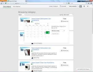
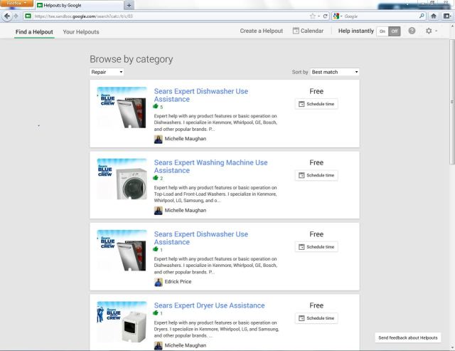
Meet Helpouts, Goolge's Secret Project That Turns Hangouts Into A Commerce Platform
Tags:
(Posted on Jul 26, 2013 at 02:23PM )
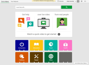 While its roots lie in search, today, Google wears many hats. From self-driving cars and wearable technology to social networking and mobile operating systems, there are few industries where the search and advertising giant has yet to make its presence felt. Lately, however, Google’s expansion has taken a noticeable tack in a more singular direction: e-commerce.
With the outsized success Amazon and eBay have had building online marketplaces that seek to remove the barriers around buying and selling on the web, it was only a matter of time before Google decided to pull its chair up to the e-commerce table. Today, TechCrunch has learned via a tipster that Google has quietly been pursuing its marketplace ambitions under the auspices of a new platform that leverages its increasingly powerful cloud services to power live, real-time commerce.
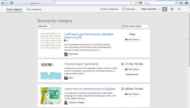
The product, which has reportedly been named “Helpouts†and is currently being tested internally in Mountain View, will take shape as a marketplace that enables individuals and small and large businesses to buy and sell services via live video. With the capacity to connect merchants and consumers on both an immediate and scheduled basis, according to our tipster, the platform will allow sellers to create their own profiles and take advantage of reputation management, scheduling and payment features, while offering robust search and discovery tools for consumers.
Â
Â
As its live video infrastructure is increasingly becoming the unifying backend for its expanding roster of real-time products, Google’s new marketplace will leverage Hangouts to deliver services via live video. To that end, the platform will also come integrated with what could end up being a handful of Google products, particularly its young virtual wallet and payment service, Google Wallet.
From what we’ve heard, Google began internal testing of the product in late June, but may be at least a month away from a public release.
In the meantime, from what we can gather from leaked mockups of Helpouts, the platform seems reminiscent of eBay’s recent efforts to expand its own marketplace with the launch of Secretguru, its concierge-style platform that allows merchants to offer a range of services directly to consumers — from business mentoring to beauty tips.
Â
Â
Part of the reason Amazon has sprinted out to such a commanding lead in the e-commerce market is its growing network of fulfillment centers and distribution warehouses, which allow it to produce that magic, online retail bullet of low prices, convenience and speedy delivery. Without a fulfillment network, Google’s own local shopping ambitions seem to be taking a different shape. With Helpouts, Google, like eBay appears to be leaning into the territory of collaborative consumption marketplaces like, say, Zaarly, TaskRabbit and Live Ninja.
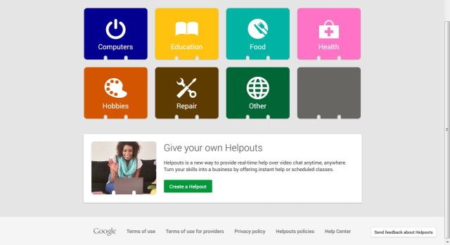
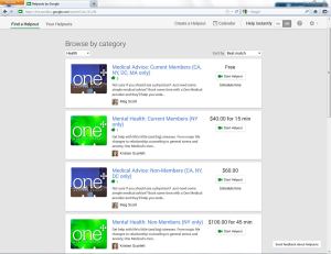
According to our source, Helpouts, like these startups before it, will cover a range of categories, including computers, education, food, health, hobbies and repair. One can then imagine services on Helpouts ranging from health consultations and fitness classes to appliance repair support and cooking lessons.
Google has also apparently partnered with a number of brands during internal testing, including One Medical Group, Sears, Weight Watchers and Alliance Frances, for example. At launch, the platform will also reportedly include an array of individual merchants and instructors as well, from yoga gurus to fitness teachers — all of whom will be able to offer both free and paid services to consumers via Helpouts.
According to our sources, with Helpouts, Google is looking to remove some of the barriers that have traditionally stood in the way of the seamless delivery of live services. For example, using Helpouts, a Spanish tutor from Argentina could offer language training to students in Japan, while a Yoga instructor in New York would be able to provide classes to a stay-at-home mom in Wyoming and an appliance repair shop could walk a customer through fixing a broken fan in their laptop — with an Internet connection being the only requirement.
Under the new, “One Google†Era, the company has begun to prioritize a greater collaboration or interrelationship between its products. With Helpouts, one could also imagine how the platform can act as a logical extension of Google’s core search and ads business. For example, customers could connect to retailers and manufacturers to get recommendations and advice on product purchases — or receive guidance on how to set up their products.
This could work to shore up a nagging gap for Google: When it comes to product searches, people no longer turn to Google. It’s all about Amazon. It also wouldn’t be a stretch to imagine Helpouts connecting to YouTube to offer video or lesson playback or integrating with Google’s nerd glasses.
Â

Â
 Of course, as with any Google product launch, life could be getting a little bit tougher for its smaller (and startup-y) competitors. There is a long list of businesses that either parallel or would directly compete with some part of Helpouts, whether it be LiveNinja, PowWow (which is, believe it or not, founded by a former Googler), Live Moka, InstaEdu, Shmoop and, perhaps less directly, platforms like Angie’s List, Udemy, Skillshare, TaskRabbit, CreativeLive and Curious. Though, admittedly, some of these overlap more than others. When it comes to big data or resources that can be thrown into curating a service offering like this, startups are bringing a knife to a gun fight. Firstly, there’s plenty of room for a more polished, higher-quality product in this space and, secondly, Google has video tech that’s already been widely adopted by individuals and businesses. Not to mention, most startups can’t hold a candle to Google’s marketing machine.
Furthermore, according to our sources, Google has been building Helpouts in complete secrecy — well, until now — and few employees at the company were initially aware of the product, which has been developed by a team of two dozen engineers over the past year. Other than that, details are hazy. Perhaps Sergey and his secretive Google X unit are responsible. Only time will tell.
Â
 fight. Firstly, there’s plenty of room for a more polished, higher-quality product in this space and, secondly, Google has video tech that’s already been widely adopted by individuals and businesses. Not to mention, most startups can’t hold a candle to Google’s marketing machine.
Furthermore, according to our sources, Google has been building Helpouts in complete secrecy — well, until now — and few employees at the company were initially aware of the product, which has been developed by a team of two dozen engineers over the past year. Other than that, details are hazy. Perhaps Sergey and his secretive Google X unit are responsible. Only time will tell.
In the meantime, some may be wondering, if Helpouts is destined for YouTube (or at least HangOuts)-level adoption, or whether this is more of an experiment and it will just end up suffering the same fate as Reader or the geek-adored Wave. It’s not totally clear just how much marketing spend Google is going to dish out or whether it intends for this to have mass-appeal, but based on what we’re seeing, I would lean towards the affirmative.
Furthermore, while the type and date of the product’s rollout remain unclear, we’ve heard from sources that Helpouts was recently the subject of a company-wide meeting, which suggests that at least a few Googlers are taking this seriously.
Stay tuned for more.
By Rip Empson
DealerNet Services
Listen To Your Mother: Advice For Making The Sale On Your Website (Part 2)
Tags:
(Posted on Jul 13, 2013 at 01:51PM )
 A wise person would have taken my mother’s advice the first time.
Alas, when it comes to shopping online there are hurdles and derailments in every corner, waiting to sabotage your efforts. And my mother finds them all.
Why does that matter?
Because my mother is retired and she has a laptop that goes everywhere with her, from home to vacation home. She’s not very tech-savvy but she’s quick with a mouse and has a disposable income. In other words, she’s your customer.
Or she could be, if you didn’t screw the whole thing up so badly!
It’s been three years since my mother and I began our phone ritual of her complaining about a website and me writing it down.
She’s had a lot to say about customer service along the way and plenty on the subject of websites that don’t work.
She may be just one person but where there’s one there are more. They visit your website and silently leave, never to be seen or heard from again. They may not vocalize their frustrations but they’re certainly acting on them – or failing to act, by refusing to buy from you.
If you’re not convinced, just listen to my mother…
Mother Says: What The Heck Is It?
“People should try to shop on their own sites,†she says. “Do you think they’d buy something if they had no idea what it was?â€
She’s talking about the shower curtain.
She wants a new one for the guest bathroom in her vacation home. Her vacation home is strictly beach-themed. And the shower curtain she wants has a pattern of small… somethings… that may or may not fit with the theme.
“Is it a duck? Maybe it’s a seahorse. I have no idea.â€
Maybe you’ve been there. Maybe you’ve tried to shop for anything from home décor to clothing and been unable to discern polka dots from plaid, or in this case, ducks from seahorses.
“Sites need a zoom feature. You can’t just look at something that small and say, ‘Oh, ok, I guess it’s fine…’ You have to know what you’re buying. Do you know what I did? I got a magnifying glass.â€
She says this with a mix of disgust and triumph – how dare “they†make her resort to such stupid tactics, but kudos to her for thinking of it.
“You know what it was? A seagull! A big, fat, ugly seagull!â€
If there’s one thing my mother hates it’s birds of any sort. If there’s another thing that pulls in at a close second it’s being forced to interpret some aspect of a product that should have been clearly identified by the “click to zoom†function or mentioned somewhere in the product description.
And my mother may hate birds but she is really pissed by the effort involved in discovering the birds. The birds have come to represent the entire site. And she’s totally gone.
“And do you know what else?â€
The thing about crummy websites is that there is usually a “what elseâ€.
“Half the time the alternate colors don’t work. So when you see a color called ‘majestic’ how the heck are you supposed to know what that looks like? What the heck color is ‘majestic’?â€
I have to admit, I have no idea.
If You Want Her To Buy, You’d Better Show Her What It Is
I don’t think this is an issue that needs belaboring. If you haven’t figured out by now that your product photos matter then you can go back and read her previous complaints to the same effect.
Or you can try shopping your own site and looking objectively at your seahorse/duck/bird patterns to be sure another human being – perhaps one with imperfect eyesight – can tell what they are.
And for the sake of overburdened brains everywhere, avoid cute marketing-y sounding descriptions in favor of real ones. If you need help crafting product descriptions, go read this post.
No matter how you slice it, “majestic†is not a color.
Lesson Learned: Details Matter
It could be the indecipherable photos or indescribable colors. Or maybe even the lack of photos and color details. If you’re not paying attention to how your products appear to your customers you just may not have any customers to worry about.
It’s definitely tough to be objective about your own inventory so do yourself and your sales a favor and find an outsider to give you honest feedback.
It could be as simple as recruiting your mother.
Â
Â
A colleague, cousin or Twitter acquaintance will do just as nicely – as long as they are dead honest and maybe even a little nitpicky. Because trust me, your customers will be.
by
Â
Â
Â