
2013
Autospeak-Straight Talk contains articles covering digital and social media marketing social communities and events marketing
The following article by Lisa Barone exemplifies Forrest Gump's famous saying “Simple is as simple doesâ€and in this sense is how you must construct your web pages to make them easy to navigate and your calls to action and vital information visible. Inundating people with all kinds of bells and whistles only distracts and confuses them.
Utility is the name of the game if you want to keep moving your customer through the funnel. Â Keep a constant eye on how your pages are working to make adjustments and remember this is all a constant work in progress
William Cosgrove
Utility is the name of the game if you want to keep moving your customer through the funnel. Â Keep a constant eye on how your pages are working to make adjustments and remember this is all a constant work in progress
William Cosgrove
6 Usability Mistakes That Kill Conversions
Â

It's happened to you before.
You arrived on a website confident in your mission. You needed to buy a vacuum cleaner! But once you got to Target.com or Amazon.com or wherever you planned to make your purchase, you become enraged.
- What category are vacuums in? Home? Electronics? Tools?
- How do you get through the site?
- Where do you click to see reviews?
- Are there color options?
- Is that a link in the corner?
- What if you want to search by price?
- Or by brand?
Bad usability kills otherwise pleasant website experiences and makes customers angry. Angry customers don't buy things.
User experience design is about creating the right path for your users and removing unnecessary roadblocks. Below are six common usability roadblocks killing your customers' experience and your bottom line.
1. You Aren't Keeping it Simple
The secret to creating a great user experience is to keep it simple. Don't put the navigation on the right side, if your audience expects it to be on the left. Don't make links green, when they should be blue. Don't design fairies to cascade down the page as a user reads it.
As a marketer or a business owner, there are plenty of avenues where you can be clever. The architecture and the design of your website really shouldn't be one of them.
Create a simple site by designing a logical page structure that is based on headers, lists, and paragraphs. Use a simple navigational structure.
Don't create Flash-based navigation, have crazy dropdowns, or insert elements that serve no function to the user. Have consistency of design and messaging throughout the site to help visitors understand where they are.
A great user experience is one where the visitor didn't notice there was supposed to be a struggle. It just worked.
2. You Tried to be Pretty, Not Useful
Your website has a single goal: to allow users to quickly and effectively accomplish their mission. If your website does this, it is successful. If it doesn't, it has failed.
It doesn't matter if your site has lots of well-written content, if the videos are engaging, or if you have more resources than your audience could possible read through; if it doesn't solve their problem, it's all for nothing.
Build a site that is useful by understanding your audience and their needs. You may choose to do that through:
- Keyword research
- Analyzing user queries
- Talking to your customer support team
- Tracking movements and behavior patterns
- Organizing focus groups
- Creating user personae
Or maybe you'll do a combination of those things. That's great. Identify your visitor's ultimate goal and then create a site that's sole purpose is to help them achieve that.
3. You Forgot Words (or Spelled Them Wrong)
I know all the experts have told you no one reads on the Internet and that your customers don't care about your content. But those people are wrong.
High-quality content helps to separate a good user experience from a poor one. Great content solves the pain points of your audience, it defines the benefits (not the features) of your product or service, it sparks emotion, and it excites a user to take an action.
High-quality content doesn't contain jargon or misspellings, come from sketchy sources, or make people question whether you're serious about your website.
4. You Give Too Many Options
There is no pain quite like arriving at your local diner when you're already starving. You're handed that menu and suddenly you can order nearly anything. Breakfast. Lunch. Dinner. Soup. Salads. It's all on the table, leaving you feeling completely unable to make a decision.
Too many choices is a problem that paralyzes. Instead of finding what we need, we start wondering if this is the best we can do.
We second guess. We overanalyze. We become anxious and frustrated.
Avoid this by guiding your customers into the correct course of action by limiting the choices offered. Your homepage doesn't have to feature every product in your arsenal, maybe just your three best sellers. If a customer likes those, he or she can look further.
Less is more. Cater to what you're good at and remove distractions.
5. You Didn't Make the Action Obvious
If you want visitors to do something, make it obvious what you want them to do.
- If you want them to click on a link, tell them in the copy and make the link blue.
- If you want them to download a report, title the button "Download" and use bright colors to get their attention.
- If you want them to share a piece of content, ask and make it easy for them to do so.
Make sure you visitors know the purpose of the site and what it is you want them to do, regardless of where they land.
6. There's No Communication
Always give visitors a way to communicate with you and your team. Allow them to report bugs, to share their experience, and to tell you where they got lost.
Be proactive by reminding them to tell you these things and let them know how you want them to communicate. Do you want them to have the conversation on Twitter or via a contact form? Encourage users to support your site by supporting them.
Summary
You'll notice none of the recommendations above are particularly hard to implement. That's because good usability is based on best practices and creating an experience that intuitive and makes sense for a user.
How well is your site doing at covering the basics?
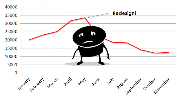 Planning a website redesign can be an extremely exciting process. You have a blank canvas to which you can easily add your own creativity and flair. It's tempting to get carried away.
Unfortunately, most designers and creative teams will use this opportunity to focus entirely on the visual design of the site, and overlook SEO, content, and functionality.
Sites with a history of good search traffic can see most or even all of that traffic vanish after a redesign. That new site may look great, but that won't be much consolation to their owners!
Yes, it's important to have a great looking website. It needs to look great if it's going to convert your visitors into paying customers, but traffic, conversions, and functionality are what will ultimately govern its success or failure.
So, what are the key considerations when implementing a site re-design?
1. Have You Done Your Research?
To design a website that's going to deliver results, you need to know who you're targeting. The design, functionality, and SEO focus should all be dictated by informed research. That means market research, keyword research, and community mapping.
This should be your first port of call, not an afterthought. If you have this information from the very beginning you can then use in in every aspect of your redesign.
Benchmarking your existing data will allow you to identify what is currently working, and what has worked in the past. Be sure to evaluate which pages are the most popular, convert the best, rank and deliver the most leads/sales. Doing so will fuel the new site with proven techniques and allow you to gauge the site's success post-launch.
2. Website Structure
A redesign isn't simply a chance to give your website a fresh look. It also gives you the opportunity to reorganize the way your site is structured.
To make sure your information architecture is set up for optimal visibility and conversions, your priority should be analyzing the effectiveness of your current site:
- Which pages convert the best?Â
- What's the most common route through your website?Â
- Do some pages have a high bounce rate?
Use all of this information to improve the architecture of your new site.
Mobile phones, tablets and alternative devices must also be considered. There are a few primary approaches:
- Responsive
- Adaptive
- Mobile site
- Apps
Each approach has their advantages. You'll want to consider factors like site goals, personalization, site complexity, timeframe, and budgets.
3. Redirects – 301 & Canonicals
Inventory all pages, incoming links, and pages that rank well from the very beginning. Don't forget about subdomains.
As the URL structure is changed, a redirect strategy will be incredibly important to retaining any SEO rankings and rerouting referral traffic to the new pages/URLs.
Audit and analyze where all incoming links are coming from, and going to. This can be done using tools like Open Site Explorer and Majestic SEO, among others.
Once you have an inventory of backward links, you'll want to map them along with all pages to their new location using 301 redirects. This is also a great time to establish your canonical strategy for "www", index files, and other forms of duplicate content.
Tip: The redirect strategy will likely change based on design, navigation, and content, among other factors. Knowing this in advance will help alleviate future frustrations.
4. Navigation
How easily your site can be navigated, by both human visitors and search engine spiders, will have a significant effect on the visibility and success of your new website. You need to look at site structure from two different standpoints:
-
How are people going to find your site? This is where you need to be thinking about your URL structure. Can it be shortened? Are there lots of unnecessary characters? Does the URL give pride of place to the term you'd most like that page to rank well for?
A redesign gives you the chance to give your entire URL structure a reshuffle and cut away any dead wood that may have developed as part of your existing site's development. Your new URL structure and sitemap should make it easy for the search engines to see what each page is about and make sure that you're using the most important terms for each of your campaigns. -
How your human visitors will navigate the site once they've found it? Which pages have you identified as your primary entry points? What action do you want visitors to each of these pages to take? What journey will they need to take in order to take that desired action? Can you do anything to shorten this journey or increase conversions?
By taking an informed, data-driven look at your existing site structure and optimizing it in line with your new site's primary objectives, you have a chance to drastically improve the performance of your site.
5. Where Does the Content Fit In?
We all know that content is the most important aspect of any digital campaign. So why is it still so often an afterthought when sites are designed?
The quality, visibility, and relevance of your content will be the most influential factor in determining the success or failure of your new site. Shouldn't it be given some attention during the design process?
One primary consideration is what type of content will be published on-site.
- Are you going to have a blog?Â
- Is that blog going to be mostly visual or will you be publishing long, informative articles?
These questions should always be answered before you start designing the site. This gives you the opportunity to effectively integrate the blog into the overall design of your new website. It will also give you a chance to make sure that visitors can always find the most relevant content for them – and that they can find your blog, no matter what page they're on.
Another consideration is whether you'll be offering any other content through your site.
- Will you be publishing whitepapers, eBooks, video tutorials?Â
- If so, how will they be delivered?Â
- Will you offer them in return for an email address?Â
- Will they be available to anyone, or only available to members?
As with each of the previous points, considering your content before you finalize the site design will make it far more functional, profitable, and effective.
6. Technical SEO
Your site's position in the SERPs depends on many different factors (more than 200, according to Google). This means that your redesign gives you more than 200 different areas that you can look to improve, condense, and build on to increase your search visibility, site authority, and trust.
Three key areas you should pay close attention to during the redesign process are:
- Page load times: Far too often companies launch a site that looks great, but only if you wait around for long enough for the homepage to load. Unfortunately, visitors to your site won't put up with it, and as a result, neither will the search engines. Your redesign should be seen as an opportunity to speed up your site, not slow it down.
- Compliance: This area is also often overlooked by site designers. If you want your site to work in the modern online marketplace it needs to conform to recognized standards. This means it needs to adhere to section 508 and W3C compliance factors as well as EU Cookie laws (if applicable).
- Coding: Your site redesign should be seen as an opportunity to give your code a spring-clean. As you know, search engine spiders can only read text. Images, videos and other web elements can all hide and disguise this text so that search engines have difficulty reading it. This means that they are also very unlikely to give your pages high visibility for those disguised terms. To ensure that your site has the greatest possible search visibility, you need to make sure that your code makes it as easy as possible for the spiders to crawl your site. If you're in any doubt, use a tool like this to see your pages from a search engines point of view.
7. Testing
In an ideal situation, budgets and time would be unlimited. If we had the budget and time, every single component of the site would be pitted in a death match fight to the death based on analytical data. This would include all wireframes, mock-ups, images, color, content and the list goes on.
Obviously, we can't do this. But don't forget about the advantages gained if we could, and remember to incorporate testing into your process.
Conclusion
Digital marketing is quickly evolving into an entirely integrated discipline. A website redesign is a major event in any digital marketing campaign, so it makes sense that this process should also be as integrated as possible.
If a site is going to deliver real value, it shouldn't be left to just designers and aesthetic considerations. Your SEO team, copywriters, sales team and social media managers should all be heavily involved, right from the start.
By Brad Miller
http://dealernetservicesonline.biz